The Iconic Design From 90s Fast Food That People Want in Their Dining Rooms
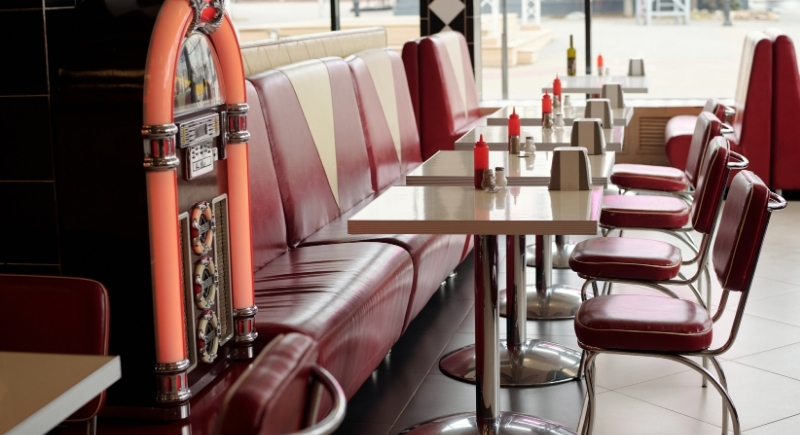
Fast food chains in the 1990s had interiors that leaned into vibrant, saturated colors, and Taco Bell became one of the clearest examples. Purple booths, teal trim, neon accents, and sharp geometric graphics turned each location into a recognizable environment, not just a stop for food. Decades later, homeowners are pulling visual cues from places they visited weekly as kids, long before dining rooms became beige and forgettable.
Why Those Interiors Stuck In People’s Heads

Image via Canva/Pressmaster
Design memory forms through repetition as families visited the same restaurants after school events, road trips, and late nights. The spaces became emotional landmarks tied to routine. When chains shifted toward muted palettes in the 2000s, the food was familiar, but the rooms lost personality. The visuals people remember most are rarely the minimal ones. They are the spaces that felt specific and unmistakable, even if the menu stayed the same nationwide.
The Surprising Home Design Change

Image via Canva/victorzastolskiy
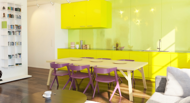
The next generation of homebuyers in the United States is decorating differently than previous generations. Instead of chasing neutral resale appeal, many lean into self-expression. Design surveys show rising interest in bold cabinetry, patterned wallpaper, and color-blocked furniture. Dining rooms have become a testing ground, even though they are outside daily living spaces, but they still invite personality. That makes them ideal for playful color choices without overwhelming the rest of the house.
Fast Food Aesthetics Translate Surprisingly Well
The visual language of 1990s fast food adapts easily to residential spaces. Geometric patterns show up in rugs and upholstery. Bright plastics translate into molded chairs or acrylic lighting. Neon signage inspires LED accent lights in controlled doses. Even color pairings like purple and teal reappear in cabinets or wall art. But homeowners rarely recreate entire restaurants. They borrow specific elements that feel familiar without crossing into parody.
Why Minimalism Is Losing Its Grip
Minimalist dining rooms dominated the 2010s, driven by social media and open-concept layouts. Clean lines photographed well, but many rooms felt interchangeable. Designers now acknowledge fatigue with spaces that lack visual interest. Color introduces warmth and personality that plain white walls cannot. The return of expressive interiors signals a shift toward comfort and nostalgia rather than strict trend compliance.
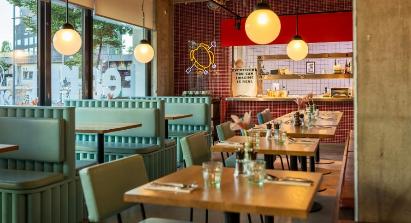
Fast food interiors once reflected optimism about mass culture. They aimed to feel fun, accessible, and welcoming to families. When chains modernized, they chased efficiency and global sameness, and that change left a gap between memory and reality. But home design fills that gap, and people now recreate certain pieces of the environments that shaped their sense of normal. It explains why a booth color or wall pattern can feel more personal than a high-end dining set.
What This Says About Design Right Now

Image via Pexels/Sebastian Luna
The appeal of 1990s fast food design has little to do with irony. It reflects a desire for spaces that feel intentional and emotionally familiar. Dining rooms are becoming places that tell stories rather than follow rules. Borrowing ideas rooted in everyday experiences makes those rooms feel lived in instead of staged. The designs that once surrounded quick meals now influence how people gather at home, proving that visual memory lasts longer than many menu items.