Hidden Messages in Famous Food Brand Logos You’ve Probably Never Noticed
Logos often tell a brand’s story, but some take it a step further. While many logos are straightforward, others hide clever details that most of us miss at first glance. These hidden messages range from subtle design tricks to nods to a brand’s roots. Let’s explore some logos with sneaky surprises you probably never noticed.
Tostitos
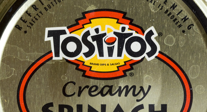
Credit: flickr
Take a closer look at the Tostitos logo. The two “Ts” are shaped to look like people, and the dot on the “I” becomes a bowl of salsa. It’s a subtle, clever detail that gives the logo a playful vibe, almost as if two friends are sharing chips and dip.
Wendy’s
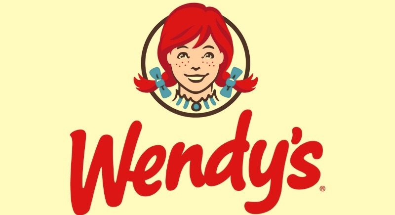
Credit: Wikimedia Commons
If you’ve ever stared at Wendy’s logo, you might have noticed something interesting on her collar: it appears to spell “Mom.” Though the company says it wasn’t meant to be there, many people believe it subtly ties into the homey, comforting vibe that Wendy’s wants to evoke with its food.
Hershey’s Kisses
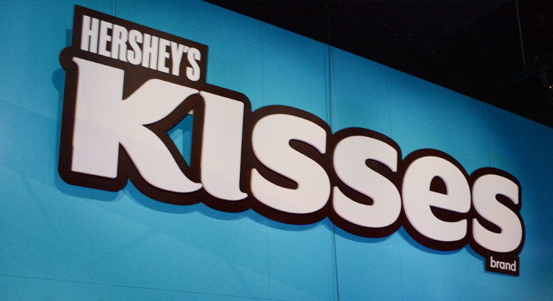
Credit: Wikimedia Commons
Tilt your head slightly, and you might notice something sweet tucked between the “K” and the “I” in the Hershey’s Kisses logo. A third Kiss hides in the negative space, a clever design touch that’s been there since the ‘70s.
Subway
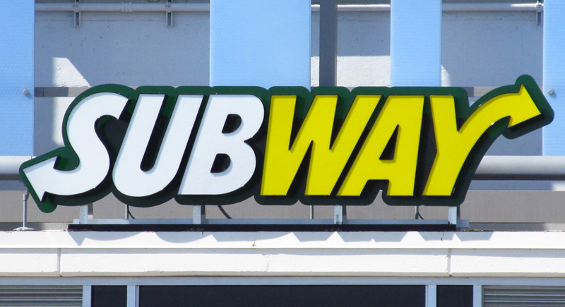
Credit: flickr
The arrows at the start and end of the Subway logo represent a literal subway entrance and exit. These directional cues help reinforce the idea of a quick, in-and-out sandwich experience, which has been a part of the brand’s identity since the 1970s.
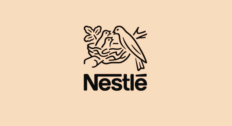
Nestlé
Credit: flickr
Nestlé’s bird-in-a-nest logo comes directly from founder Henri Nestlé’s family crest. Even more fitting? In German, “Nestlé” translates to “little nest.” This meaningful symbol has been part of the brand since the 1800s and continues to be used across several product lines.
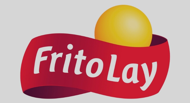
Frito-Lay
Credit: Wikimedia Commons
While Frito-Lay’s logo looks bright and sunny, the yellow circle represents a sun, which symbolizes fun, lighthearted moments like barbecues and picnics. It visually links the snacks to summertime gatherings and outdoor memories without needing a single word to say it.
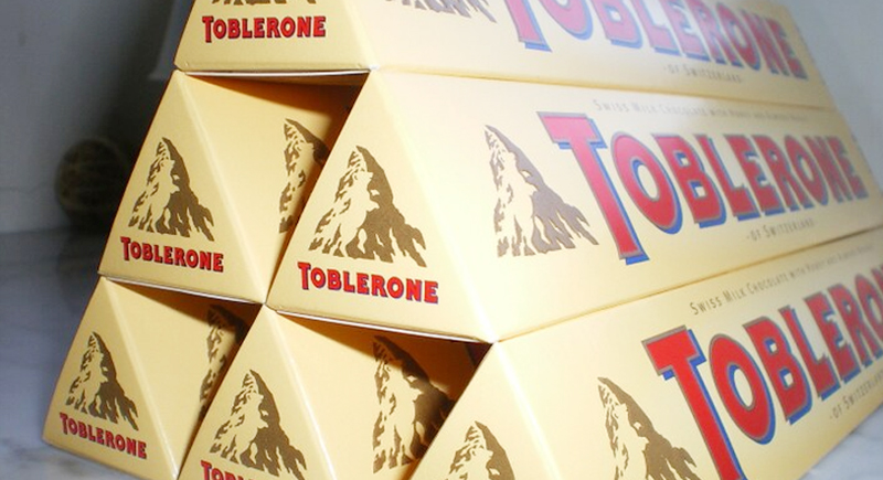
Toblerone
Credit: flickr
There’s a bear hiding in the mountain on the Toblerone logo, and it’s not just a fun Easter egg. The brand originated in Bern, Switzerland, also known as the “City of Bears.” Spotting the bear takes a sharp eye, but it’s hard to miss once you see it.
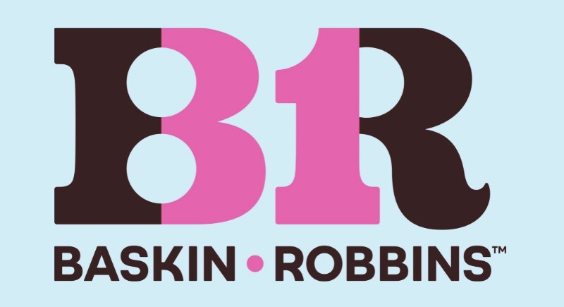
Baskin-Robbins
Credit: Wikimedia Commons
The pink and blue colors of the Baskin-Robbins logo are a classic ice cream combo, but there’s a hidden detail worth noticing. In the “B” and “R,” you’ll find the number 31, a nod to the brand’s original claim of offering 31 flavors—one for every day of the month.
Twix
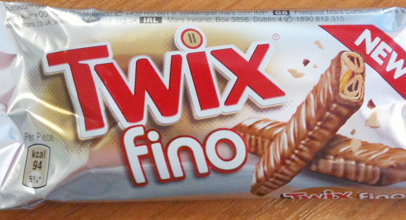
Credit: flickr
The dot over the “I” in the Twix logo has sparked a couple of ideas. Some see it as a reference to the brand’s two-bar setup, while others think it’s a pause button to remind you to take a moment and enjoy a treat. Over the years, Twix has embraced both interpretations.
Orbit Gum
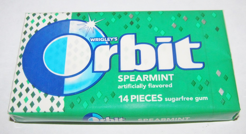
Credit: flickr
Orbit’s logo features a split “O,” one half dark and the other light. This simple design represents the Earth’s day-and-night cycle, while reinforcing the brand’s message of lasting freshness. It’s a clever visual that ties right back to the name.
Chick-fil-A

Credit: flickr
The “C” in Chick-fil-A’s logo is shaped to resemble a chicken’s head and beak. It instantly hints at what’s on the menu. This design has evolved over time, but the chicken-in-the-C concept has remained since the brand’s early days.
Heinz
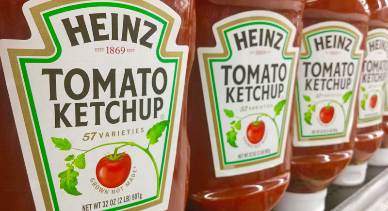
Credit: flickr
You’ve seen “57 Varieties” on every Heinz ketchup bottle, but the company never made exactly 57 products. Founder Henry Heinz just liked the number. He saw an ad for “21 styles” of shoes and thought a catchy number could do wonders for branding. It stuck.
Domino’s
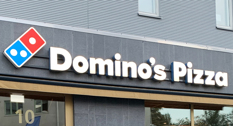
Credit: Wikimedia Commons
The three dots on the domino tile represent the chain’s first three stores. The original plan was to add a dot for every new location, but that plan was quickly dropped with the company’s rapid expansion. The three-dot logo stuck around, though, as a tribute to humble beginnings.
McDonald’s
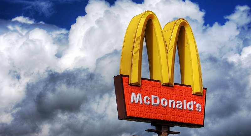
Credit: flickr
The golden arches weren’t always part of the plan. In the 1960s, consultant Louis Cheskin persuaded McDonald’s to keep them. He suggested that their shape resembled comforting maternal symbols, which could subtly connect the brand with feelings of nourishment and familiarity. Over time, the arches became a part of the McDonald’s identity.
Pepsi
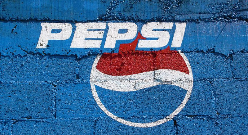
Credit: flickr
Pepsi’s current globe-like logo may look abstract, but the red, white, and blue color scheme isn’t accidental. It was chosen during WWII to align with American patriotism. Later redesigns kept the colors but added layers of meaning tied to science, feng shui, and brand energy.