What Famous Fast-Food Logos Looked Like Then Versus Now
Fast-food logos rarely stay the same. Over the decades, each redesign has mirrored shifts in design trends and customer expectations. The updates reveal how these chains want to be recognized—whether as neighborhood spots or worldwide brands. Looking back at the changes explains why the signs you see today don’t always match the ones you remember.
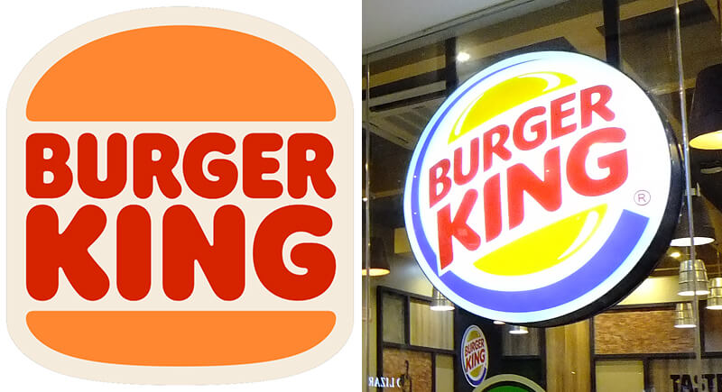
Burger King Has Gone Full Circle
Credit: Wikimedia Commons
Burger King’s latest redesign in 2021 feels familiar for good reason. It mirrors the version used from 1969 to 1999. The new look features flat buns and bold, retro-inspired lettering. Executives aimed to spotlight the Whopper and eliminate elements like “shiny buns” that didn’t reflect real food.
McDonald’s Used to Feature a Cartoon Mascot

Credit: Wikimedia Commons
Before Ronald McDonald took the stage and arches became the brand, there was Speedee, a cheerful, winking chef with a knack for fast food. He appeared in the ’50s as the face of the “Speedee Service System.” By the ’60s, McDonald’s phased him out, leaning into the now-iconic arch-based design that defined the next era.
Popeyes Dropped the Biscuits and Went Regional

Credit: Wikimedia Commons
Once named Popeyes Chicken & Biscuits, the brand leaned heavily on cartoon fonts and banners. After rebranding as Popeyes Louisiana Kitchen in 2008, it embraced red and orange hues and added a fleur-de-lis nod to its New Orleans origins. In 2020, the logo became cleaner, bolder, and entirely orange with a simplified chicken mark.
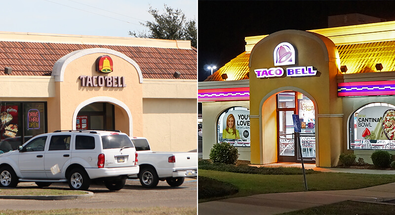
Taco Bell Simplified and Went Monochrome
Credit: Wikimedia Commons
Taco Bell’s early signs were full of color and detail, complete with a bell illustration. In the 1990s, the look shifted to a sharper, angled design. By 2016, the company pared it back again, settling on a flat white bell set against purple with a plain, modern typeface.
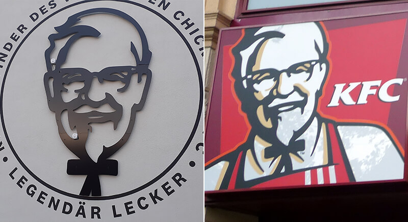
KFC Added Color and a Chef’s Apron
Credit: Wikimedia Commons
The first KFC logos showed Colonel Sanders in simple black-and-white line art. Later versions added color, sharper outlines, and the now-familiar red apron. By the early 2000s, the brand shortened its name to KFC, intensified the red background, and redrew the Colonel at a closer angle, shifting him from a flat emblem to a recognizable brand figure.
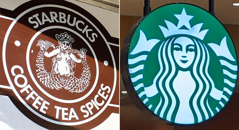
Starbucks Focused on the Siren
Credit: Wikimedia Commons
Starbucks began with a detailed brown siren logo in the 1970s. By the late 1980s, the design shifted to green, with a more modest version of the figure. In 1992, the mark was cropped tightly around her face, and in 2011, the company removed the surrounding text, relying on the simplified siren alone for recognition.
Subway Adjusted Its Arrows and Brightened Up
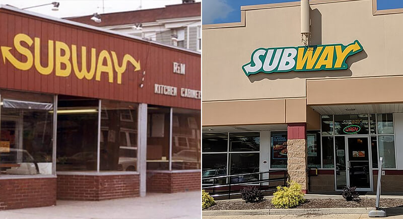
Credit: Reddit/Wikimedia Commons
Subway’s first logo in the 1960s featured yellow block letters. By 1982, the brand embraced a slanted font with arrow tips on the “S” and “Y.” In 2016, it brightened the palette and adjusted the arrows for a cleaner, more modern look while preserving the sandwich motif subtly.
Domino’s Dropped ‘Pizza’ to Elevate the Brand
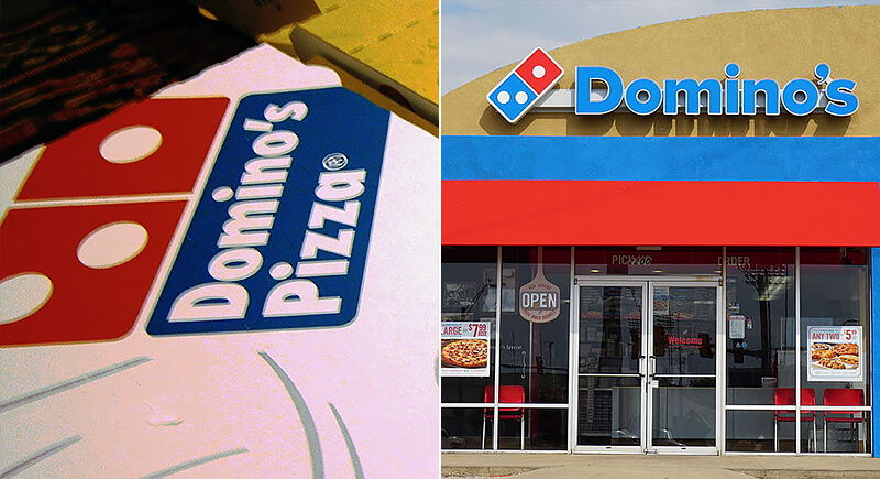
Credit: Wikimedia Commons
Early Domino’s logos paired a red domino symbol with the word “Pizza.” In 2012, the company dropped the word entirely, leaving only the domino tile and a simplified typeface. The change signaled a broader identity, positioning Domino’s as a brand that wasn’t limited to pizza alone.
Dunkin’ Moved On From Donuts
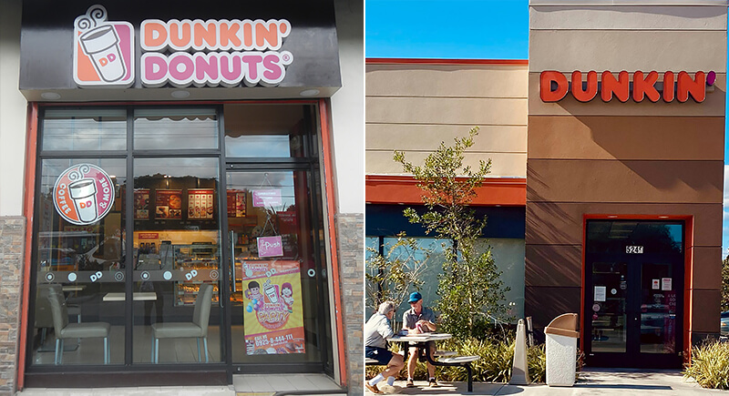
Credit: Wikimedia Commons/pexels
Back in the day, Dunkin’ Donuts had cursive fonts and literal doughnut mascots. Over time, they leaned into bright colors and coffee imagery. Then, in 2019, a rebrand dropped the “Donuts” completely. What’s left is a confident “Dunkin’” wordmark that knows its caffeine game can stand alone without a frosted companion.
Wendy’s Gave Its Mascot a Lighter Update
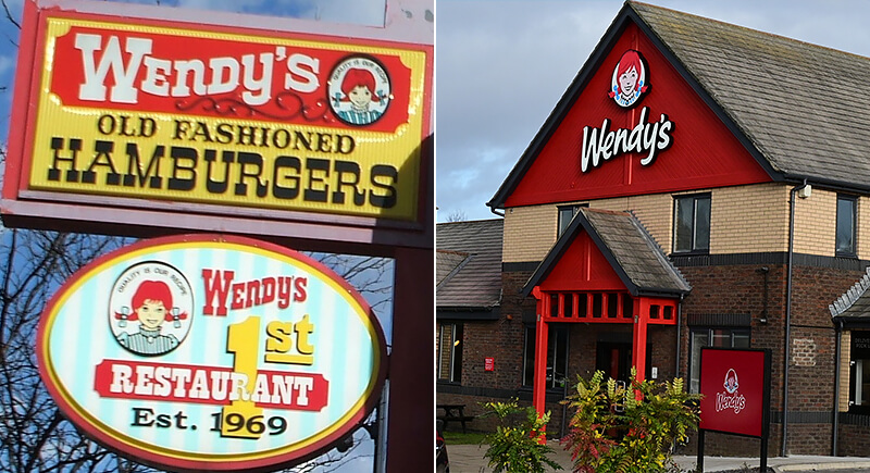
Credit: Wikimedia Commons
From 1969 to 2013, Wendy’s logo stayed largely consistent with red block letters, Wendy’s portrait, and a bold emblem. But the 2013 version softened the lettering, gave the mascot a more expressive, modern look, and ditched the ornate frame, aligning the design more closely with contemporary branding trends.
Cracker Barrel Briefly Ditched the Barrel

Credit: Facebook/Wikimedia Commons
In 2024, Cracker Barrel tried something risky. The brand introduced a stripped-down logo, just the name in clean font—no man, no barrel. Feedback was swift and unsparing. Within weeks, the company brought back the seated figure and the barrel. Turns out, the old-timey visual wasn’t just background. It was the identity.
Jack in the Box Retired the Clown
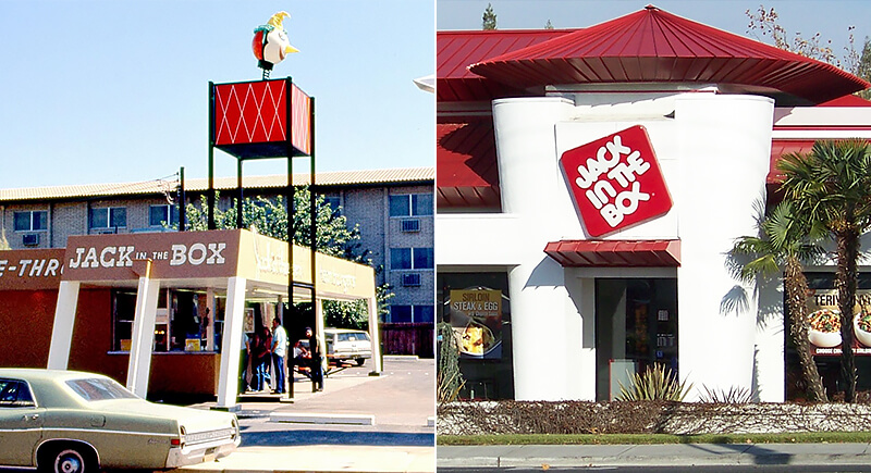
Credit: Reddit/Wikimedia Commons
Jack in the Box first used a jack-in-the-box clown as its mascot. The character disappeared in the 1980s, replaced by a simple red wordmark. In 2009, the logo shifted again, with a lowercase “jack” set inside a tilted red box. The box design stayed on as the brand’s central mark.
Carl’s Jr. Streamlined Its Star Mascot
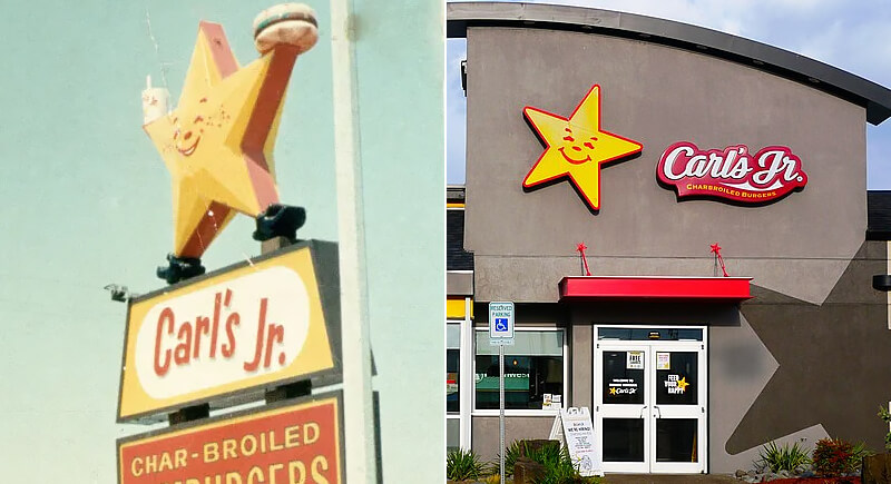
Credit: ebay/Wikimedia Commons
Carl’s Jr. originally used a smiling star holding a burger. As branding trended toward minimalism, the company retained the star but dropped the cartoonish face. The current logo features the yellow star with clean, black text and was further polished in 2022 to match its Hardee’s counterpart.
Pizza Hut Went Back to the Roof
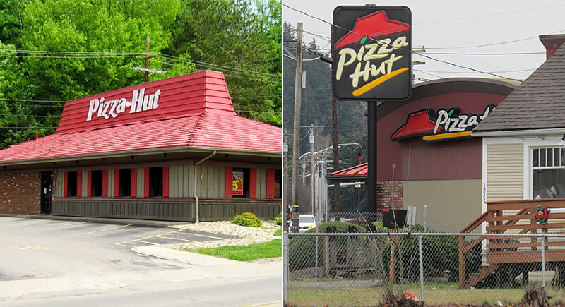
Credit: Wikimedia Commons
The red roof has seen things. Early Pizza Hut logos leaned into cursive fonts, but by the 1970s, the roof design started showing up. The 2010s brought experiments using swirling pizzas and funky fonts, but nostalgia won. By 2019, Pizza Hut was back under the roof, with a flat design that felt retro without being dated.
Arby’s Refined the Hat and Simplified the Look
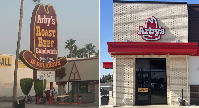
Credit: Wikimedia Commons
The original Arby’s logo featured a brown cowboy hat and long-form branding. Over time, the hat became red and sleeker, with the name “Arby’s” written in lowercase. The current design retains the hat’s shape but with more modern line work and a sharper font.